Tooltip
Renders an animated tooltip on hover with configurable position and easing variants. Uses CSS hover states for visibility, with optional JavaScript enhancement for subtle mouse-following motion.
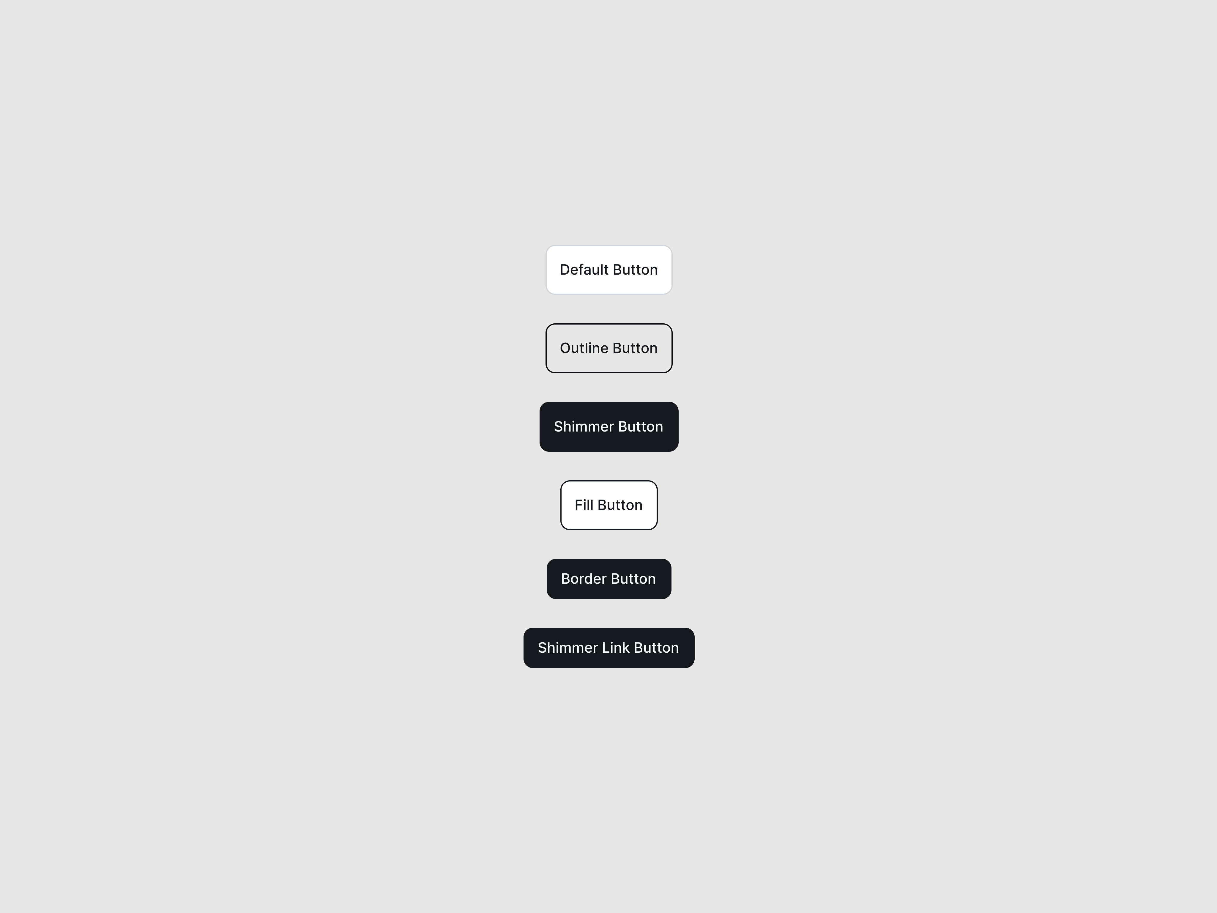
Preview/Playground
Created by  Vipin
Vipin
#FFFFFF
Tooltip text
 Astro
Astro import Tooltip from '@astroanimate/core/Tooltip';
<Tooltip content="Tooltip text" position="top">
<button style="padding: 12px 24px; border: none; border-radius: 6px; background: #3b82f6; color: white;">
Hover me
</button>
</Tooltip>Installation
bash
npm install @astroanimate/coreUsage
---
import Tooltip from "@astroanimate/core/Tooltip";
---

<Tooltip content="Tooltip text" position="top">
  <button>Hover me</button>
</Tooltip>
Wraps any element to show a tooltip on hover.
<Tooltip content="Tooltip text" enhance>
  <button>Hover me</button>
</Tooltip>
Enables cursor-based motion enhancement while hovering.
Props
| Prop | Type | Default | Description |
|---|---|---|---|
content | string | - | Tooltip content text (required) |
position | "top" | "bottom" | "left" | "right" | "top" | Tooltip position relative to wrapped element |
variant | "fade" | "spring" | "float" | "spring" | Animation easing variant (controls how tooltip enters) |
enhance | boolean | false | Opt-in to JS-enhanced mouse-following behavior |
duration | number | 200 | Transition duration in milliseconds |
class | string | "" | Additional CSS classes for wrapper |
Behavior
- Tooltip visibility is controlled entirely by CSS hover states
- JavaScript enhancement does not control visibility
-
When
enhance=true, JavaScript adds dynamic cursor-following motion by adjusting transform values - Without enhancement, all animations are handled purely via CSS transitions
Use When
- Displaying contextual help or hints on hover
- Showing additional information without cluttering UI
- Needing lightweight, animated tooltips with position control
- Adding subtle motion polish with optional cursor-following effects
Avoid When
- Content is critical and must always be visible
- Tooltip needs to contain interactive elements (it is non-interactive)
- Users may have difficulty with hover-based interactions
- Click or focus-based interactions are required instead of hover
Accessibility
-
Includes
role="tooltip" -
Tooltip is non-interactive (
pointer-events: none) and cannot contain clickable or focusable elements -
Respects
prefers-reduced-motionmedia query - Movement transforms are disabled under reduced motion, while opacity-based fade is preserved
- JS enhancement is automatically disabled when reduced motion is preferred
Performance
- CSS-first approach (no JavaScript required by default)
- JS enhancement only adds lightweight mousemove listeners
- WeakMap prevents duplicate initialization
- MutationObserver handles cleanup on DOM removal
Credits
- Credit to @Vipin