Feature Name
Short description of the feature
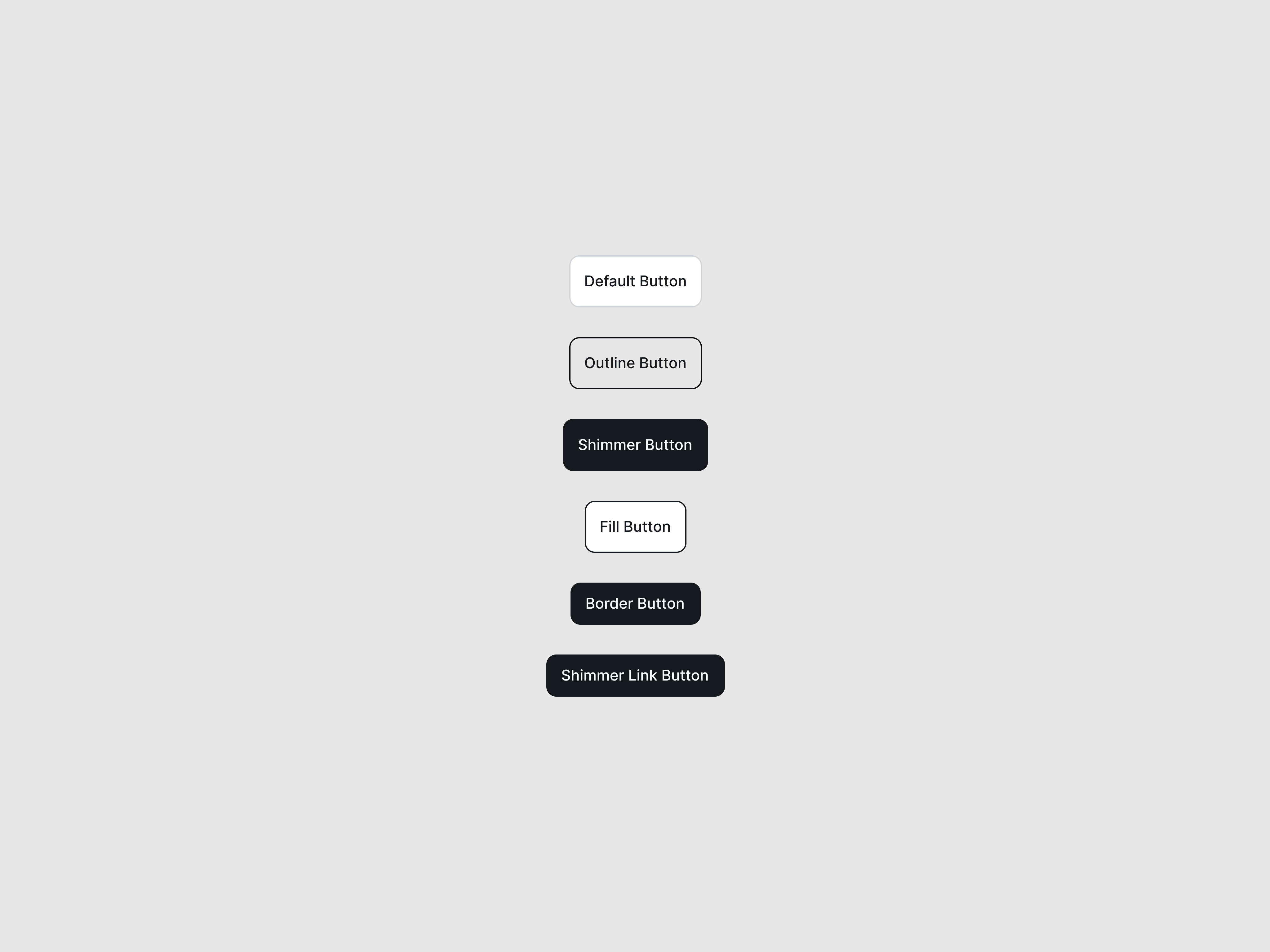
Card component with lift, scale, shine, and flip variants.

Short description of the feature
Short description of the feature
Beautiful shine animation
 Astro
Astro import AnimatedCard from '@astroanimate/core/AnimatedCard';
<AnimatedCard
title="Feature Name"
description="Short description of the feature"
variant="lift"
color="rose"
/>
<AnimatedCard
title="Feature Name"
description="Short description of the feature"
variant="scale"
color="emerald"
/>
<AnimatedCard
title="Feature Name"
description="Short description of the feature"
variant="shine"
color="violet"
/>npm install @astro-animate/cardimport AnimatedCard from '@astroanimate/core/AnimatedCard';
<AnimatedCard
title="Feature Name"
description="Short description of the feature"
variant="lift"
color="rose"
/>Displays a themed card with lift animation on hover.
| Prop | Type | Default | Description |
|---|---|---|---|
title | string | - | Card heading (required) |
description | string | - | Card body text (required) |
variant | "lift" | "scale" | "flip" | "shine" | "lift" | Animation style |
color | "rose" | "emerald" | "violet" | "amber" | "rose" | Theme color |
selected | boolean | false | Shows "Selected" badge |
selectedOnScroll | boolean | false | Shows indicator on scroll (35% visibility threshold, -12% root margin, fires once) |
class | string | "" | CSS class name (merged with customClass) |
customClass | string | "" | Additional CSS class (merged with class) |
style | string | "" | Inline styles |
href | string | - | Renders as link when provided |
target | string | - | Link target attribute |
rel | string | - | Link rel attribute |
backTitle | string | - | Back face heading (flip variant) |
backDescription | string | "Tap or click the button below to flip this
card back." | Back face description |
backButtonText | string | "Flip Back" | Flip button text |
flipHint | string | "Flip to reveal more details" | Flip instruction text |
iconLabel | string | "✦" | Fallback icon character |
minHeight | string | "18rem" | Minimum card height |
ariaLabel | string | - | Custom ARIA label |
| Slot | Description |
|---|---|
icon | Custom icon content |
back-content | Custom back face content (flip variant). Note: flip-back button always renders after this slot |
Override these variables to customize styling:
| Property | Default | Description |
|---|---|---|
--animated-card-radius | 1.5rem | Card border radius |
--animated-card-padding | 1.5rem | Card padding |
--animated-card-shadow | 0 14px 30px rgba(2, 6, 23, 0.24), 0 2px
10px rgba(2, 6, 23, 0.2) | Default box shadow |
--animated-card-shadow-active | 0 28px 52px rgba(2, 6, 23, 0.42), 0 0 0 1px
rgba(255, 255, 255, 0.03) | Active state shadow |
--animated-card-title-size | 1.25rem | Title font size |
--animated-card-icon-size | 3.5rem | Icon container size |
--animated-card-accent | (theme-dependent) | Accent color |
--animated-card-accent-text | (theme-dependent) | Accent text color |
--animated-card-border | (theme-dependent) | Border color |
--animated-card-soft | (theme-dependent) | Soft background color |
--animated-card-aura | (theme-dependent) | Ambient glow color |
--animated-card-surface | (theme-dependent) | Front face background |
--animated-card-back-surface | (theme-dependent) | Back face background |
--animated-card-inset | (theme-dependent) | Inner glow color |
At max-width: 640px: