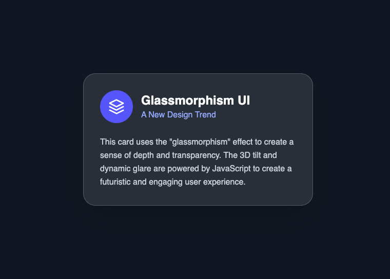
ExpandableCard
Renders an expandable card with image, title, and content. Uses a progressive enhancement model where content is fully visible by default, and JavaScript enables interactive expand/collapse behavior.
Preview/Playground
Created by  Barsan
#FFFFFF

Embercrest Summit Trail
1886 by Helen Rowe & Elas Mendez
 Astro
Astro import ExpandableCard from '@astroanimate/core/ExpandableCard';
<ExpandableCard
title="Embercrest Summit Trail"
subtitle="1886 by Helen Rowe & Elas Mendez"
image="/images/expandable-card-img.avif"
enhance
>
<div style="display: grid; grid-template-columns: repeat(3, 1fr); gap: 20px;">
<div><p>12.4km</p><p>Distance</p></div>
<div><p>870m</p><p>Coverage</p></div>
<div><p>4h 45m</p><p>Duration</p></div>
</div>
<p style="color: #666; margin: 0; font-size: 16px;">
Embercrest Ridge rises boldly from the heart of the Silverpine Mountains.
</p>
</ExpandableCard>Installation
bash
npm install @astroanimate/coreUsage
import ExpandableCard from '@astroanimate/core/ExpandableCard';

<ExpandableCard
  title="Card Title"
  subtitle="Optional subtitle"
  enhance
>
  <p>Your content here</p>
</ExpandableCard>
Enables interactive expand/collapse behavior with smooth transitions.
Props
| Prop | Type | Default | Description |
|---|---|---|---|
title | string | - | Title text rendered in the card header (required) |
subtitle | string | "" | Subtitle text below the title |
image | string | Unsplash URL | Image URL for the card header |
imageAlt | string | "Card image" | Alt text for the image |
initialOpen | boolean | false | Whether the card starts in the expanded state |
duration | number | 300 | Transition duration in milliseconds |
easing | string | "ease" | CSS easing function for transitions |
enhance | boolean | false | Enable JavaScript-powered expand/collapse interaction (click, keyboard, aria attributes) |
class | string | "" | Additional class name for the root element |
Behavior
- Content is fully visible by default (no JavaScript required)
-
When
enhance=true, JavaScript enables interactive expand/collapse behavior -
JavaScript sets
data-stateattributes, while CSS handles all visual transitions -
Initial state is controlled via
initialOpenand rendered server-side -
When collapsed, content height is animated using
grid-template-rows - Trigger element becomes interactive only after JavaScript initializes
- Chevron icon is hidden without JS and shown when enhancement is active
Use When
- Collapsible content sections that should remain accessible without JavaScript
- Progressive enhancement scenarios where interactivity is optional
- Simple expand/collapse UI with smooth transitions
- When keyboard-accessible toggle behavior is required
Avoid When
- Content must be hidden by default without JavaScript (content is always visible initially)
- Complex nested or multi-level accordion structures
- Advanced animation choreography beyond simple expand/collapse
Accessibility
-
Respects
prefers-reduced-motion(disables transitions) -
When
enhance=true:-
Adds
role="button",tabindex="0", andaria-expanded - Supports keyboard interaction (Enter and Space)
-
Adds
- Focus-visible styles support keyboard navigation
- Content remains fully accessible without JavaScript
Performance
-
CSS-first animation using
grid-template-rows(no layout thrashing) -
JavaScript only updates attributes (
data-state, ARIA) - WeakMap prevents duplicate initialization
- MutationObserver ensures cleanup when element is removed from the DOM
Credits
- Credit to @barsan