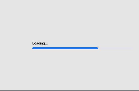
Loader
Renders a loading indicator with three animated variants (spinner, dots, pulse) using CSS animations.
Preview/Playground
Created by  Vipin
Vipin
#FFFFFF
 Astro
Astro import Loader from '@astroanimate/core/Loader';
<Loader type="spinner" />Installation
bash
npm install @astroanimate/coreUsage
---
import Loader from "@astroanimate/core/Loader";
---

<Loader type="spinner" />
Displays a default spinner loader.
Props
| Prop | Type | Default | Description |
|---|---|---|---|
size | number | 40 | Size in pixels |
color | string | "#3b82f6" | Primary color |
speed | number | 1 | Animation speed in seconds |
type | "spinner" | "dots" | "pulse" | "spinner" | Loader type variant |
mainClassName | string | "" | Additional CSS class |
Use When
- Displaying loading states during data fetching
- Showing async operation progress
- Indicating content is being loaded
Avoid When
- Complex loading indicators with progress bars needed
- Custom animation sequences required
Accessibility
-
Includes
aria-label="Loading"androle="status" -
Respects
prefers-reduced-motionmedia query (disables animations)
Performance
- CSS-only animations (no JavaScript overhead)
- Minimal DOM footprint
Credits
- Credit to @Vipin