Glassmorphism UI
A New Design Trend
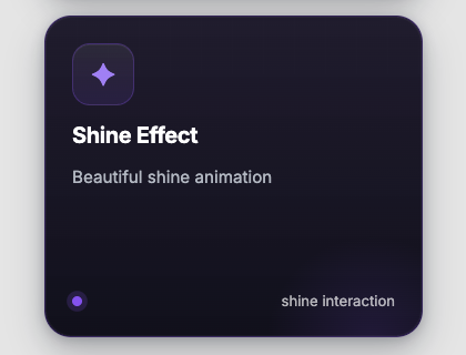
Renders a glassmorphism card with 3D tilt effect and dynamic glare on mouse movement.
A New Design Trend
This card uses the "glassmorphism" effect to create a sense of depth and transparency. The 3D tilt and dynamic glare are powered by JavaScript to create a futuristic and engaging user experience.
 Astro
Astro import GlassCard from '@astroanimate/core/GlassCard';
<GlassCard
title="Glassmorphism UI"
subtitle="A New Design Trend"
description="This card uses the glassmorphism effect to create depth and transparency."
enableTilt={true}
backgroundColor="#232933"
containerBackground="#111722"
/>npm install @astroanimate/core---
import GlassCard from "@astroanimate/core/GlassCard";
---
<GlassCard
title="Feature Title"
subtitle="Category"
description="Description text"
icon="<svg>...</svg>"
enableTilt={true}
/>Displays a styled card with glass effect and optional 3D tilt interaction.
| Prop | Type | Default | Description |
|---|---|---|---|
title | string | "Glassmorphism UI" | Card title text |
subtitle | string | "A New Design Trend" | Card subtitle text |
description | string | Long default text | Card description text |
icon | string | SVG icon string | Icon as SVG string or image URL |
iconColor | string | Linear gradient | Background color for icon container |
backgroundColor | string | rgba(255, 255, 255, 0.1) | Card background color |
borderColor | string | rgba(255, 255, 255, 0.2) | Card border color |
containerBackground | string | "white" | Container background color |
tiltIntensity | number | 10 | Maximum tilt angle in degrees |
enableTilt | boolean | true | Enable/disable 3D tilt effect |
titleColor | string | "#ffffff" | Title text color |
subtitleColor | string | "#a5b4fc" | Subtitle text color |
descriptionColor | string | rgba(255, 255, 255, 0.7) | Description text color |
class | string | "" | Additional CSS classes |
style | string | "" | Additional inline styles |
ariaLabel | string | title value | ARIA label for accessibility |
ariaLabel prop for screen
readers
prefers-reduced-motion media query to disable transitions
enableTilt is true