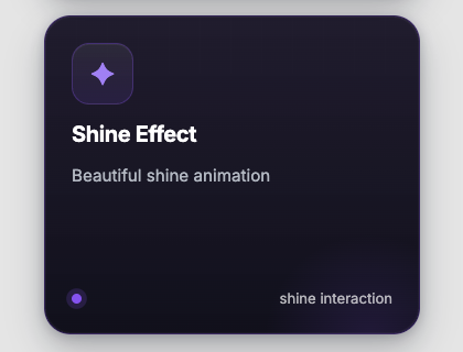
Learn how to create reusable, accessible, and performance-first UI components in Astro using modern CSS architecture, component composition, and scalable design patterns for production-ready applications.
Find out moreArticle/blog card with image preview, hover lift effect, and CTA link.


Learn how to create reusable, accessible, and performance-first UI components in Astro using modern CSS architecture, component composition, and scalable design patterns for production-ready applications.
Find out more Astro
Astro ---
import ArticleCard from "@astroanimate/core/ArticleCard";
---
<ArticleCard
title="UI Animation Patterns"
description="Interaction ideas for modern interfaces."
image="/images/article-cover.jpg"
href="/blog/ui-animation"
/>
<ArticleCard
title="Building Scalable Design Systems with Astro"
description="Learn how to create reusable, accessible, and performance-first UI components in Astro."
href="/blog/design-systems"
/>npm install @astroanimate/core---
import ArticleCard from "@astroanimate/core/ArticleCard";
---
<ArticleCard />Renders the ArticleCard component with AstroAnimate defaults.
| Prop | Type | Default | Description |
|---|---|---|---|
title | string | - | Article title |
description | string | - | Article description |
href | string | "#" | Article link |
image | string | - | Article image URL |
actionLabel | string | "Find out more" | CTA text |
class | string | "" | Additional CSS classes |
:focus-visiblearia-hidden="true"alt="" attributeprefers-reduced-motionloading="lazy" for images